The Cooperage: What’s in a Name?

There’s a lot to consider when you pick a typeface to represent your company. In addition to the visual elements like line, weight and shape, you might also want to consider contextual elements like historical or cultural references. Then again, sometimes just the name of the typeface is enough to get the gig, as I suspect is what happened in the case of The Cooperage and its choice of Cooper Black for its wordmark. Hangin’ with Mr. Cooper The Cooperage […]

Read more

C’mon Baby, Let’s Do the Twisters

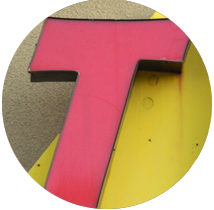
In 1987, Albuquerque experienced a rare weather phenomenon for this area: a tornado. This was no over-hyped dust devil, but real honest-to-goodness twister, complete with uprooted trees and damaged buildings but (fortunately) no loss of life. Now we have Twisters all over the place. Not the cyclone kind, but the burrito kind. (My weekend is not complete without the No. 4 with red chile.) Holy Ad Lib!!! The typeface in the Twisters logo is a perfect analogy of the 1987 […]

Read more

Welcome to Alphaquerque

As you drive, bike or walk around any city in America, you’re going to be overwhelmed by typography. Giant letters looming large on storefront signs, billboards, posters, flyers, bumper stickers and so on. We call this environment the typescape. And in this respect, Albuquerque is not much different from any other large American city. What does make us different, though, are the occasionally unique gems of letterforms and logos that you’ll only find here. As we slog our way through […]

Read more