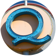
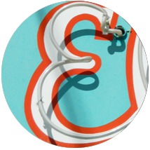
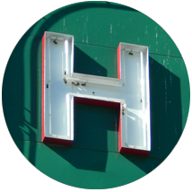
Welcome to Alphaquerque
As you drive, bike or walk around any city in America, you’re going to be  overwhelmed by typography. Giant letters looming large on storefront signs, billboards, posters, flyers, bumper stickers and so on. We call this environment the typescape. And in this respect, Albuquerque is not much different from any other large American city.
What does make us different, though, are the occasionally unique gems of letterforms and logos that you’ll only find here. As we slog our way through the banal clutter of national fast-food chains, drug stores, grocers and banks, we are at risk of losing our local identity in the stunted sameness of the American urban experience. But every once in a while we catch a glimpse of a pure, Albuquerque-born entity that reminds us that there’s no place like home.
 So many of the best examples are long gone now: the Terrace Drive-In’s swoopy script and giant neon dancer; the Octopus Car Wash’s multi-hued bold-brush letters; the clock-watching elephant of Frank’s Drive-In supporting a tower of stacked, deco capitals; the grinning blackbird of Ed Black’s Chevrolet perched atop a signature scrawl. The ever-changing typescape here is just like any other ecosystem. Some forms evolve, others go extinct. Yet they all leave a unique and sometimes lasting impression on us.
We invite you to join us on our journey through Alphaquerque, a typescape comprised  solely of the Albuquerque letters, logos, signs and symbols that surround us and imprint themselves on our lives. Along the way, we’ll share a little history and the stories behind the letters themselves. Hopefully, we’ll learn a little about typography, a lot about Albuquerque and maybe even a bit about each other. The comments are turned on. You can also follow us on Twitter, Facebook and Instagram to find out when new posts go up. I look forward to hearing your opinions, your memories, and your insights about our shared typescape.
Mayor of Alphaquerque

6:39 am
Love this look of ABQ. I miss the drive in theater signs, and some of the old motel signs along Rt 66. Things look different today! Thanks for this web project.