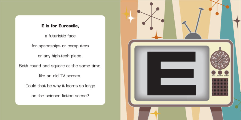
Eurostile
Eurostile
Year: 1962
Designer: Aldo Novarese
Foundry: Nebiolo Foundry

The existential dread of the early days of the Cold War were often played out metaphorically via science fiction stories in popular culture. Giant reptiles, murderous blobs and evil aliens stood in for the lurking nuclear doom that fueled our collective anxiety.
These tableaux of radioactive dystopia were widely distributed via the world’s newest mass-communication medium: television. The ubiquitous cathode ray tubes were aglow with sci-fi imagery that increasingly featured marvels of futuristic technology – blinking video monitors, buzzing instrument panels, and illuminated push-buttons – all sharing a similar design sensibility that eschewed sharp angles and embraced the rounded rectangles of post-modern design.
Reflecting this design fashion, Aldo Novarese created Eurostile in 1962, but it was based on Microgramma, a decade-old typeface. Microgramma was used primarily for titling and technical illustrations, but lacked a lower case and breadth of weights. Like like its little cousin Eurostile, it also found its way into our typescape as a friendly face for space. Eurostile and Microgramma are prominent in titles, sets and props in sci-fi franchises such as Star Trek, Alien, and Back to the Future, among many others.
