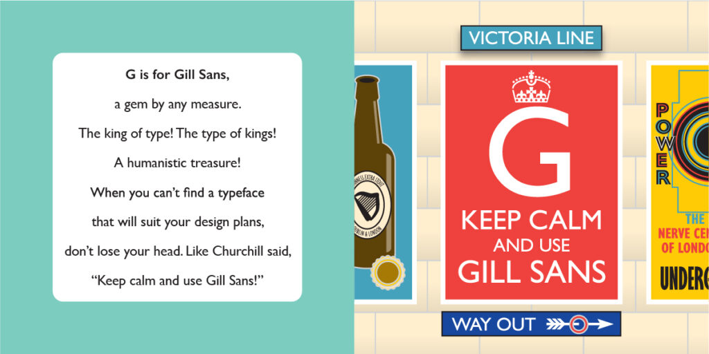
Gill Sans
Gill Sans
Year: 1926
Designer: Eric Gill
Foundry: Monotype

Eric Gill was already an accomplished British calligrapher, illustrator, sculptor and stonecutter before he embarked into the world of type design. Gill had been designing letterforms for memorials and signage when Monotype’s Stanley Morison approached him to create typefaces for the metal type foundry. He created several faces, but his most popular and enduring type creation is his namesake, Gill Sans.
Based on Edward Johnston’s alphabet that had been created for the London Underground, Gill Sans was a new kind of sans-serif. Bearing characteristics of both classical Roman letters with the new faces coming out of the Bauhaus, Gill Sans is generally classified as a “humanist” face, which marries the simple modernity of geometrics with classical hand-hewn structure.
Gill Sans has become so ubiquitous in its native land that it has been called “the British Helvetica” due its widespread usage by such iconic British mainstays as the BBC, British Railways and Penguin Books. The famous example parodied here references both the London Underground (where Gill Sans has its roots) and the famous KEEP CALM posters (which ironically did not use Gill Sans, but rather Caslon Egyptian, a typeface some 100 years older.) Further, there is no evidence that Winston Churchill ever uttered the fanciful quote in the verse shown, but I like to imagine that he at least thought it.
