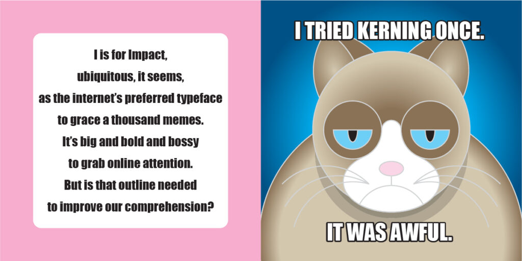
Impact
Impact
Year: 1965
Designer: Geoffrey Lee
Foundry: Stephenson Blake

If the mid 1960s are known for anything typographically it would be the widespread shift towards International Style design, as corporate identity abandoned ornamental crests and complicated ligatures for the pared back minimalism of Swiss design.
Following World War II, staid companies whose identities were calcified in pre-war styling saw themselves in need of a shot of modernity, and their embrace of grid systems and neo-grotesque typefaces became epidemic. The design community responded by creating myriad new sans-serif faces like Helvetica like Univers, which proved instantly popular with companies hungry for facelifts of their aging brands.
In that context, Geoffrey Lee’s Impact was designed to do exactly what its name implies: make an impact. With its bold weight, small apertures, short descenders and ascenders, Impact was designed to look weighty, industrial and important. That’s why it was so popular as a headline and title font, as opposed to use in body copy.
Now in the internet age, Impact continues to have an impact. Due to its wide distribution as a system font on many computer operating systems coupled with its self-important “look at me” appearance, it became the default typeface for the memeification of the web. Social media posts particularly exploited Impact’s innate gravity to help grumpy cats, tea-sipping frogs, and the world’s most interesting man to make their sometimes funny, often ironic and always urgent declarations.
