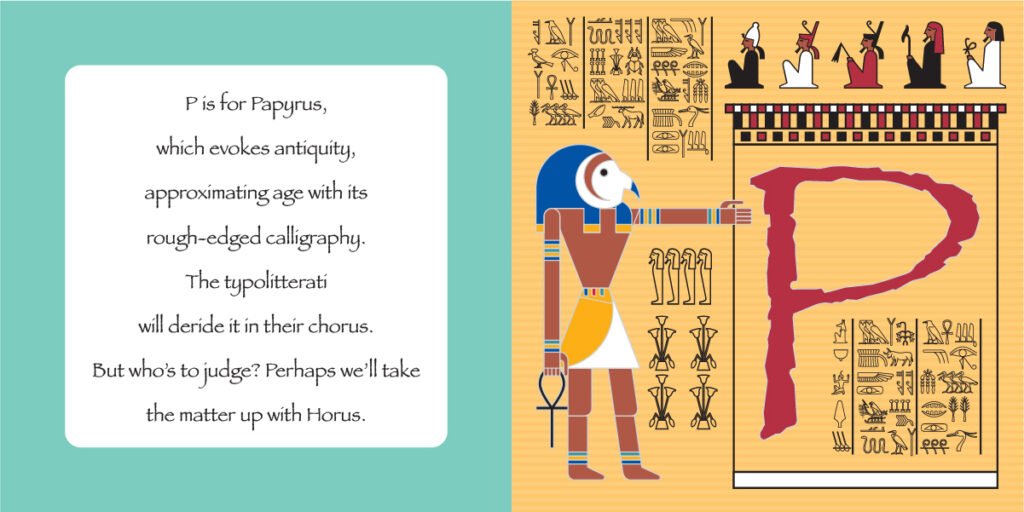
Papyrus
Papyrus
Year: 1982
Designer: Chris Costello
Foundry: Letraset

In an anger-ridden internet abundant with lisitcles of most-hated typefaces, these three exemplars are usually included: Comic Sans, Hobo and Papyrus. In fact, Papyrus is so popularly loathed by the typolitterati that it was even the butt of an elaborate joke on a popular Saturday Night Live skit.
Now that’s not to say anything negative about Papyrus (or Comic Sans and Hobo for that matter.) Papyrus is a perfectly fine typeface, but it has a strong personality that limits its proper application. Designer Chris Costello set out to explore what letters might look like if created in Biblical times using ink on, well, papyrus. The result of his experiments led to the hand-hewn, rough-edged alphabet we all love to hate.
This alphabetic antagonism is wholly unwarranted, or at least misdirected. The disdain for these typefaces should lie not in their intrinsic design, but rather in the rather lazy use, misuse and abuse by people who choose type badly. I hesitate to dictate design absolutes, but here are three guidelines I would strongly suggest you adhere to:
• Comic Sans should not be used for the financial tables in a corporate annual report.
• Hobo should not be used for pharmaceutical branding.
• Papyrus should not be used on your resumé when applying for a graphic designer position. (Not even ironically. Just don’t.)
The issue is not the typeface, its the inappropriate usage. Choosing type is about matching a typeface’s personality to the message being imparted, and too often careless decisions are made in the matter. To paraphrase Barbara Woodhouse: “There are no bad fonts, only bad designers.”
