Hobo
Hobo
Year: 1910
Designer: Morris Fuller Benton
Foundry: American Type Founders

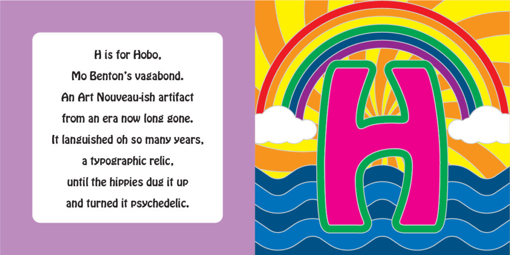
Hobo was typeface that was both behind and ahead of its time. Designed by the prolific Morris Fuller Benton in 1910, Hobo was an attempt to cash in on the fading fashion of Art Nouveau typographic design. As curvilinear ornamentation was soon to give way to geometric modernity, Hobo represents the last gasp at mimicking ornate European letterforms. One theory posits that Benton was inspired by a Russian tobacco advertisement that featured the word “HOBO” in stylistically similar hand drawn letters. (The translation of “hobo” from the Cyrillic alphabet would be pronounced “novo”, meaning “new”.
After a long period of Bauhaus and Swiss style domination of type innovation through the mid-20th century, a brief revolution of sorts occurred in the United States as a brief craze for psychedelia resulted in a revival of interest in letterforms from the Art Nouveau era. In the late 1960s and early 1970s, letters designed in the Jugendstil and Vienna Secession movements were being appropriated for use in the day-glo advertising materials targeting a younger generation engaged in various societal rebellions of their own, from music to fashion to drugs to politics. After decades of dormancy, Hobo was hip again.
