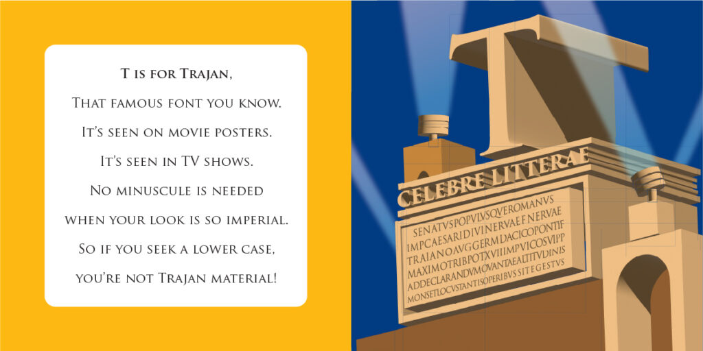
Trajan
Trajan Pro
Year: 1989
Designers: Carol Twombley and Robert Slimbach
Foundry: Adobe

It may not actually be fair to credit modern-day typographers with the creation of this typeface, as its inspiration is actually closer to 2000 years old.
In Rome today there stands a monument to the Emperor Trajan who ruled the empire from 98 to 117 A.D. Trajan’s Column rises nearly 100 feet into the air and features a spiraling narrative of the Emperor’s victories in the Dacian Wars. But it is the base of the column that is of interest to type nerds like us because that is where we find one of the finest examples of Roman Square Capitals, the foundational letterforms for Roman-style typefaces.
Carol Twombley famously studied ancient alphabets (see Lithos), but she was hardly the first to look to the landmark for inspiration. Typographers from Emil Weiss to Frederic Goudy to Jonathan Hoefler have all had their take on the capitalis momunentalis.
The alphabet of ancient Rome bore no lower case (minuscule letters wouldn’t be in vogue until Charlemagne’s time) so Trajan Pro likewise has an all-cap aesthetic. This lends it a more regal and authoritative quality, making it a favorite choice for titles and headlines seeking to impart a sense of imperial gravitas.
