Univers
Univers
Year: 1957
Designer: Adrian Frutiger
Foundry: Deberny & Peignot

Univers is more than a great typeface or even a great type family. It is a groundbreaking system that redefined what type families could be. To meet the rising demand for Swiss Style typography that was rising in popularity, Adrian Frutiger created Univers to compete with the other new sans-serifs of the day. New Haas Grotesk (soon to be rebranded as Helvetica) was released in the same year. Univers differed from its fellow neo-grotesques not only in specific character features, but also in the design and organization of the many weights and widths the family had to offer.
Prior to Univers, font families certainly offered varieties of styles and weights, but they often lacked consistency. Frutiger solved this problem by designing a font family that was harmonious and cohesive across all 21 flavors of Univers originally offered. There are now over 40 styles of Univers in the family.
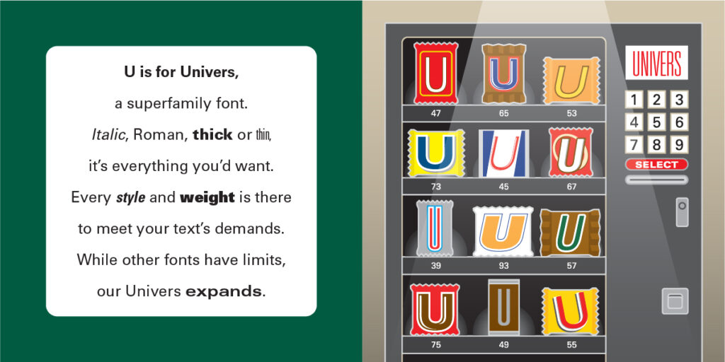
Frutiger’s other great innovation was in revising the clunky nomenclature of type families. Rather than using lengthy compound names like Univers Condensed Bold Italic, Frutiger devised a two-digit naming convention that readily identified the weight and width of the particular within the family. The first digit referenced the weight, the second the width of the letter. Odd numbers referenced upright characters and even numbers identified italics. In this manner, Univers Condensed Bold Italic could more easily be referenced as Univers 68. This allowed not only for easy identification, but also allowed for expansion of the family in the future.
<< Return to My First Book of Fonts home
