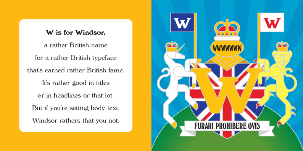
Windsor
Windsor
Year: 1905
Designer: Elisha Pechey
Foundry: Stephenson Blake

The ancient castle that is Windsor’s namesake was an obvious choice for a new surname when the royal family needed to anglicize their surname for the too-Teutonic sounding Saxe-Coburg and Gotha. Althought the typeface predates the creation of the House of Windsor by over a decade, it still invokes a very British feeling.
Designed by Elisha Pechey and released (possibly posthumously) by the Sheffield foundry Stephenson Blake, Windsor bears the hallmarks of everything I like about England: Old-style sensibility but with a modern, quirky charm. Its a face that wants to be taken seriously, but not too seriously.
It is those quirks in certain letters – the slanted legs of h,n, and m; the angled serifs of the E and F; the jutting chin of the G – that can make Windsor a challenging face to set in certain letter pairs, especially in the metal-type era in which it was born. This made Windsor an excellent choice for eye-grabbing headlines, but not ideal for body copy.
Typographer Frederic Goudy reportedly once said that “Anyone who would letterspace black letter would steal sheep.” This oft-repeated admonition of careless typesetting was the inspiration for the title of Erik Spiekermann and E. M. Ginger’s excellent book “Stop Stealing Sheep and Find Out How Type Works.” As a nod to that famous volume, in my reimagined rendering of the British Coat of Arms, I have substituted in a Latin translation of Stop Stealing Sheep for the traditional motto. I think of it as an old-style sensibility with a modern, quirky charm.
