Tekton
Tekton Pro
Year: 1989
Designer: David Siegel
Foundry: Adobe

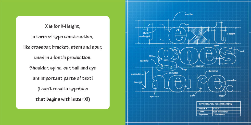
While there are no doubt some typefaces that begin with X (Xylo comes to mind) I felt that none rose to the level of familiarity to be included here. But there is one characteristic of typography that applies to nearly all typefaces, and that is x-height. X-height, as can be easily surmised, is the height of the lowercase x in a given font, which ultimately determines the height of all of its minuscules. X-height is a key feature of a typeface.
Larger x-heights (Verdana, ITC Garamond) are generally thought to make text more readable, especially in small sized body copy. Small x-heights (Kabel, Brandon Grotesque) may add a bit of elegance, but may be better suited to headline and display applications.
X-height is just one example of the glossary of architectural and anatomical terms associated with type craft. So to illustrate this, I’ve opted for an architectural blueprint calling out some of typography’s structural elements. Tekton Pro is an appropriate, even obvious, choice for this illustration. Tekton was designed by a former draftsman named David Siegel, who based his design on the lettering style of architect Francis D.K. Ching. It’s a style familiar to anyone who has seen the carefully crafted letters of a professional draftsman.
I was lucky to have exposure to this type of lettering at a young age. My father was a draftsman, and I remember him working away at his precise technical drawings and marveling at the precision not only in his drawing, but in his lettering. I suspect that that’s where the seeds of my own interest in graphic design were sown.
