Yale and ITC Galliard
Yale
Year: 2004
Designer: Matthew Carter
Foundry: Carter & Cone
ITC Galliard
Year: 1978
Designer: Matthew Carter
Foundry: International Typeface Corporation, Linotype

Not every typeface is created for commercial distribution. Some are commissioned strictly for the proprietary use of a single entity, such as a publisher (Archer for Martha Stewart Living), a manufacturer (Inspira for General Electric) or, in this case, a university.
In 2004, Yale commissioned faculty member and master typographer Matthew Carter to create a typeface exclusively for use by the school community for Yale-related work only. Carter took as inspiration the old style serif “De Aetna” typeface, designed by the 15th century master Francesco Griffo while working for for the Venetian printer Aldus Manutius in 1495. Manutius used the “De Aetna” type (named for Pietro Bembo’s publication De Aetna) in many of his popular scholarly works. “De Aetna” became the most influential Roman type design for centuries to come. Stanley Morison even created a successful version called Bembo for Monotype in 1929.
Carter’s Yale honors Griffo’s original design, but refines and simplifies the forms somewhat. Originally used for wayfinding, Carter continued to refine the typeface and produce additional weights and variants for Yale’s use in print and electronic medias as well.
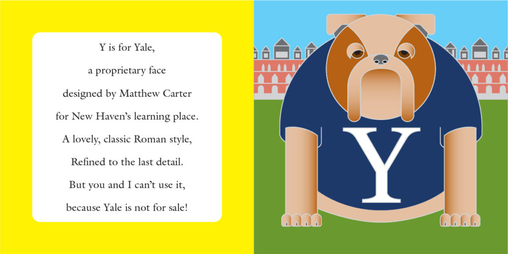
As I have no attachment to Yale (apart from a fondness for its bulldog mascot) I have no access to the typeface. This circumstance led me to use a similar typeface of Carter’s, ITC Galliard. Prior to the development of Yale, Galliard served as the school’s standard type, until Yale’s introduction in 1978. Galliard itself is also based on the work of a giant of Renaissance typography, Robert Granjon. Carter was quite familiar with Granjon’s types as his father, the type historian Harry Carter, had worked with Granjon’s collection of type and matrices at the Plantin-Moretus Museum in the 1950s.
