Zapfino
Zapfino
Year: 1998
Designer: Hermann Zapf
Foundry: Linotype

We tend to think of an alphabet as consisting of only 26 characters. But to the typographer, who has to consider designing not only uppercase and lowercase characters, but also numerals, punctuation marks, symbols, accents and ligatures, a single font’s design can run into the hundreds of glyphs. Some fonts go the extra mile and even include alternate characters with swashes or ther embellishments, small caps, mathematical symbols, dingbats, fleurons or even non-Latin alphabets like Cyrillic or Greek characters. The typecase for metal sorts had its physical limitations, but a digital typeface can literally accommodate tens of thousands of glyphs within a single font.
In 1944, Hermann Zapf envisioned a typeface that included a broad variety of alternate swashy characters that mimicked the free-flowing flexibility of a master calligrapher like himself. But the physical limitations of hot metal type production proved too difficult to overcome, so the project remained in Zapf’s notebooks for decades. Luckily, Zapf was able to revive the project in the digital typeface era, where no physical restrictions could impede its development.
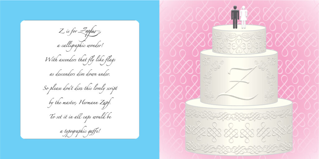
As Zapfino has an elegant hand-letter quality, it’s a popular choice for invitations and announcements. And in addition to its many alternate characters (there nine versions of the lower-case d) it also includes a broad variety of decorative swirls, swooshes and other gingerbread embellishments, some of which are used here to decorate the cake and background of our festive nuptial occassion.
