Verdana
Verdana
Year: 1996
Designer: Matthew Carter
Foundry: Microsoft

Early type design was informed by the lettermaking tools that preceded them: the ink of broad-nibbed pen, the paint of a flat-edged brush or the incision of a sharpened chisel. These forms were replicated, first in metals and later in photographic and digital processes, to recreate the familiar letter forms known since antiquity.
But with the advent of the personal computer, characters now had to be rendered not in metal or film, but on screens composed of glowing rectangular picture elements, or “pixels” for short. The first generation of these digital letterforms, called bitmap fonts, were marked by their blocky, stairstep appearance. Readable enough for screens, but hardly easy on the eyes and certainly not suitable for print.
In a nutshell: Traditional typefaces did not read well when converted to low-resolution bitmapped screen fonts, and bitmapped screen fonts did not look good when output on high-resolution printing applications. To address this conundrum, software giant Microsoft enlisted the aid of master typographer Matthew Carter to create a new typeface for its Windows operating system. Carter sort of reverse-engineered the typical approach to type design, and opted to create a typeface that began with a bitmap block foundation and was further refined with compatible outlines to achieve a face that would be attractive both in both print and on screen. The result, Verdana, was soon bundled into the operating systems of both Windows and Mac devices, garnering a nearly universal deployment on personal computers. With this newfound ubiquity, Verdana became a popular default font choice for business applications, email clients and the burgeoning legions of web developers.
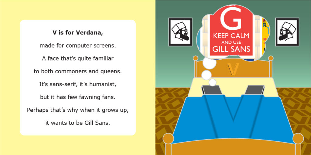
Verdana falls into the class of humanist sans-serif faces, like its predecessor Gill Sans. Also like Gill Sans, Verdana may have somewhat fallen victim to its own popularity. There exists a contingent of designers who deride Verdana as a mere “screen font” not suitable for proper graphic design projects. But I would argue that as short-sighted. Verdana is a clean, readable face with virtually no character confusion between I, l and 1. To dismiss it as a “screen font” is as misguided as dismissing Times New Roman as a “stone font.”
